Coffee and UX
Sometimes, user interface changes can result in unexpected user experience impact.
The office coffee machine broke down last week, and was promptly replaced.
From this
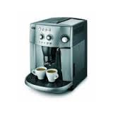 it became this

Essentially it is the same machine, but instead of having analog knobs, it has a number of buttons.
The problem is: not everyone has the same taste in coffee
Whereas before, regardless of whether the previous person likes a strong espresso or a watered-down coffee, I could always go up to the machine and twist the two knobs (controlling strength and volume) without thinking to get my perfect coffee, now I have to click, on average, six times before the machine understands what I want!
I am thinking: user test your product in real-life situation...
The office coffee machine broke down last week, and was promptly replaced.
From this

The problem is: not everyone has the same taste in coffee
Whereas before, regardless of whether the previous person likes a strong espresso or a watered-down coffee, I could always go up to the machine and twist the two knobs (controlling strength and volume) without thinking to get my perfect coffee, now I have to click, on average, six times before the machine understands what I want!
I am thinking: user test your product in real-life situation...

Comments
I wonder if we could somehow intercept the newfangled electronic gadgets and buttons and wire up a pair of knobs via an Arduino to reinstate the old interface…
Thanks
Finn Felton
Kopi Luwak